
Hanasaki Logo
Dream Client: Sushi Restaurant. Named for a particular thorny looking, bright red, sweet crab, I dove into this with excitement.
Dream Client: Sushi Restaurant. Named for a particular thorny looking, bright red, sweet crab, I dove into this with excitement.

Another logo done for a client of Scorpion. This was inspired by the clients love of Back to the Future.
Job Done Electrical Read More »
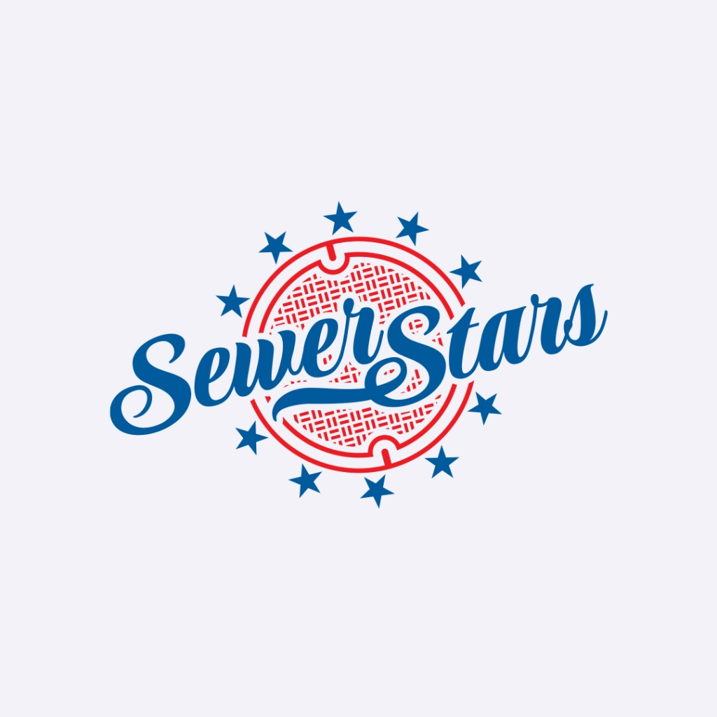
Done for a Dodgers loving client of Scorpion, this logo incorporates a sports script name, with a manhole cover behind it. Ultimately unused, this is still one of my favorite logos I’ve made.

When Behr entered the Pro market, they had to overcome a reputation as a DIY brand. Launching with a huge support network for professionals, with on-site job delivery and an enhanced pro experience online and in-store, we pushed for a campaign with a literal bear watching out for our painters. Who can mess with a

I put this little mark together when I was feeling blocked and in a rut. I wanted to be a bit creatively dangerous. I needed to blow my mind.
I worked for Behr for 7+ years, so yes, I’ve designed a few paint labels. The best and coolest rarely got past the 3d comp stage, but I am still sometimes amazed at the variety of looks that can be achieved on a gallon cylinder. This Quick Dry label happens to be the only design
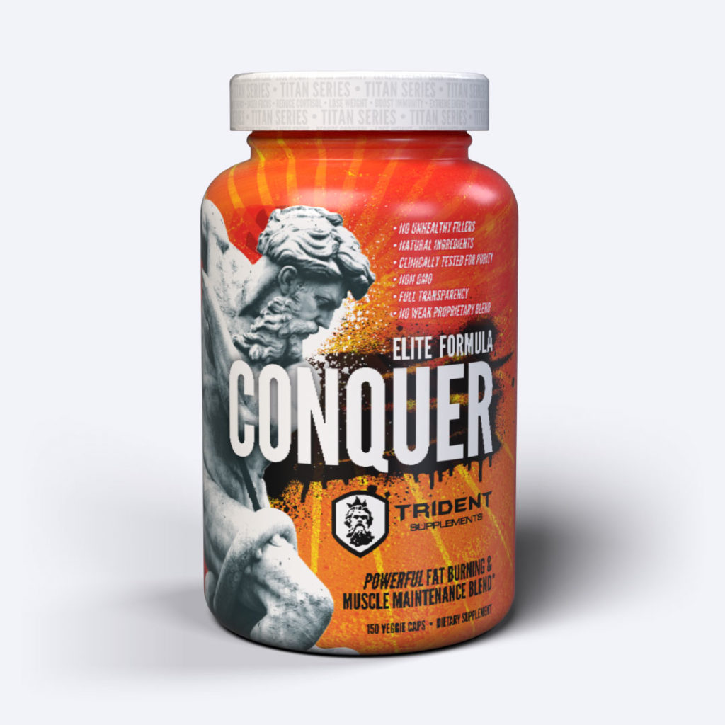
The image to your left is a rendering. I will update this image as soon as I get good photography of the actual container, but I love the way these came out. This packaging was inspired by a meeting with the client, and a chance look at a photo from his image folder: graffiti renderings
Conquer, Packaging Read More »